When we think of trademark infringement, unions don’t typically come to mind. However, in recent headlines, three different companies have alleged trademark infringement against their unions. These companies, Trader Joe’s, Medieval Times, and Starbucks, have all made similar arguments alleging confusion based upon the union’s use of the company’s name and/or branding design elements. Although both the Trader Joe’s and Medieval Times cases were dismissed for failure to state a claim, the Starbucks case is still pending after both parties filed lawsuits. Clearly, companies should not be using trademark law to suppress union activity and a union’s use of its company’s name should be permissible via nominative fair use which generally allows third-party use of a trademark to identify the trademark owner’s goods or services. However, where should the line be drawn in regard to a union’s use of design elements that may appear similar to the company’s logo and/or other branding elements?
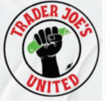
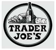
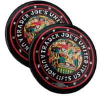
In the Trader Joe’s case, we primarily see the following logos:
Upon even a detailed review, these logos do not appear similar. As noted by the court, the only similarities are the color red and use of a circle design. Beyond these similarities, all other design elements differ, including the fonts. Additionally, the top logo, which is the union’s main logo, features a prominent fist design associated with the labor movement. The second logo features highly distinctive and colorful design elements not shared by the Trader Joe’s logo. Moreover, none of the union’s logos feature fruit a basket design and the concentric circles highly differ. The court therefore found no likelihood of confusion.
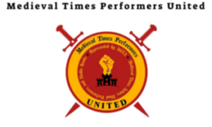
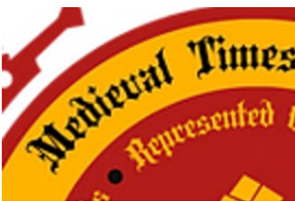
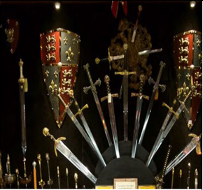
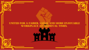
We see a similar situation in the Medieval Times case which features the following logos and branding elements:
In this case, the logos and branding elements are perhaps even less similar than the Trader Joe’s case. It is first noteworthy, that in addition to arguing similarities in the logos, Medieval Times also argues confusion based upon additional branding elements not included within its logo. This seems to be a reach, especially given these design elements consist of features that commonly appear in castles or medieval themes such as shields, swords, arched doorways, merlons, and parapets. The only similarities shared between the logos and branding elements are the red and yellow color schemes, but otherwise the design elements differ significantly. For example, in the union’s logo, MEDIEVAL TIMES instead appears in a black font that is different than the Medieval Times logo. Additionally, as with the Trader Joe’s union logo, we also see a fist placed prominently in the center of the logo with additional text clarifying the logo’s affiliation. Similar to the Trader Joe’s case, the court found no likelihood of confusion and the case was dismissed for failure to state a claim.
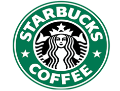
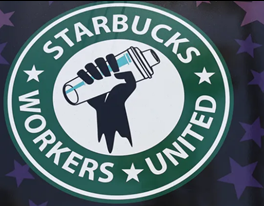
We now arrive at the Starbucks case where we encounter the following logos:
Upon a cursory and detailed review, the similarity in these logos feels different. They share the same shape, same design of concentric circles, and similar star design and colors. Although this union’s logo also features a fist, the fist appears with a shaker commonly seen at a Starbucks. Therefore, this design could instead be viewed as mixing a drink and therefore less associated with the labor movement. Even though this logo does contain the “Workers United” phrase, due to the similarity of the design elements, it is harder to notice the additional wording. Although Starbucks has recently adopted a new logo that does not feature the circle design, this older iconic logo is still used by the company.
Perhaps most indicative of the similarities is the evidence of actual confusion. The current lawsuits stem from a social media post by the union stating “Solidarity with Palestine” on October 9, 2023. The union claims the post was put on social media without authorization of union leaders and was up for about 40 minutes before being deleted. However, Starbucks claims it received more than 1,000 complaints, hostile customers, and even vandalism as a result of the post. Additionally, some lawmakers have even called for a boycott of Starbucks over the incident. It will be interesting to see how the court treats this evidence of actual confusion when evaluating the case.
In comparison to Trader Joe’s and Medieval Times, the Starbucks case appears different. Perhaps the Starbucks union did incorporate too many of the design elements associated with the iconic Starbucks logo, leading to actual confusion in the marketplace and reputational harm. The court has yet to rule in this case, but it will likely not be dismissed via a 12(b)(6) motion for failure to state a claim. Unions should be allowed to use the name of the company whose workers they represent under a nominative fair use analysis. However, incorporating a large portion of the design elements associated with the company’s logo or other branding does appear to cross the line. This brings us back to one of the essential elements of nominative fair use which involves only using the as much of the mark as reasonably necessary to identify the given product or service. Is it considered reasonably necessary for unions to incorporate any similar design elements, even if only a small portion is used? The courts have already answered this question in the affirmative by dismissing the Trader Joes and Medieval Times cases via motions to dismiss for failure to state a claim. However, any use of distinctive design elements beyond a small portion may be more than reasonably necessary to identify the company associated with the union. Hopefully, in the Starbucks case, as well in future similar cases, courts will further consider the nominative fair use doctrine when evaluating a union’s use of design elements that are similar or identical to a company’s logos and branding. With this framework in mind, courts can then develop an adequate line of caselaw to determine where the line should be.